Be consistent. The best brand system is the one your team actually uses.
Most visual identities and brand systems don’t fail because the logo is wrong. They fail because implementation is inconsistent. I work with clients to build the guardrails—style guides, intuitive print and digital templates, and production workflows—so teams can move faster, stay on-brand, and still enjoy the creative process.
W O R K S A M P L E S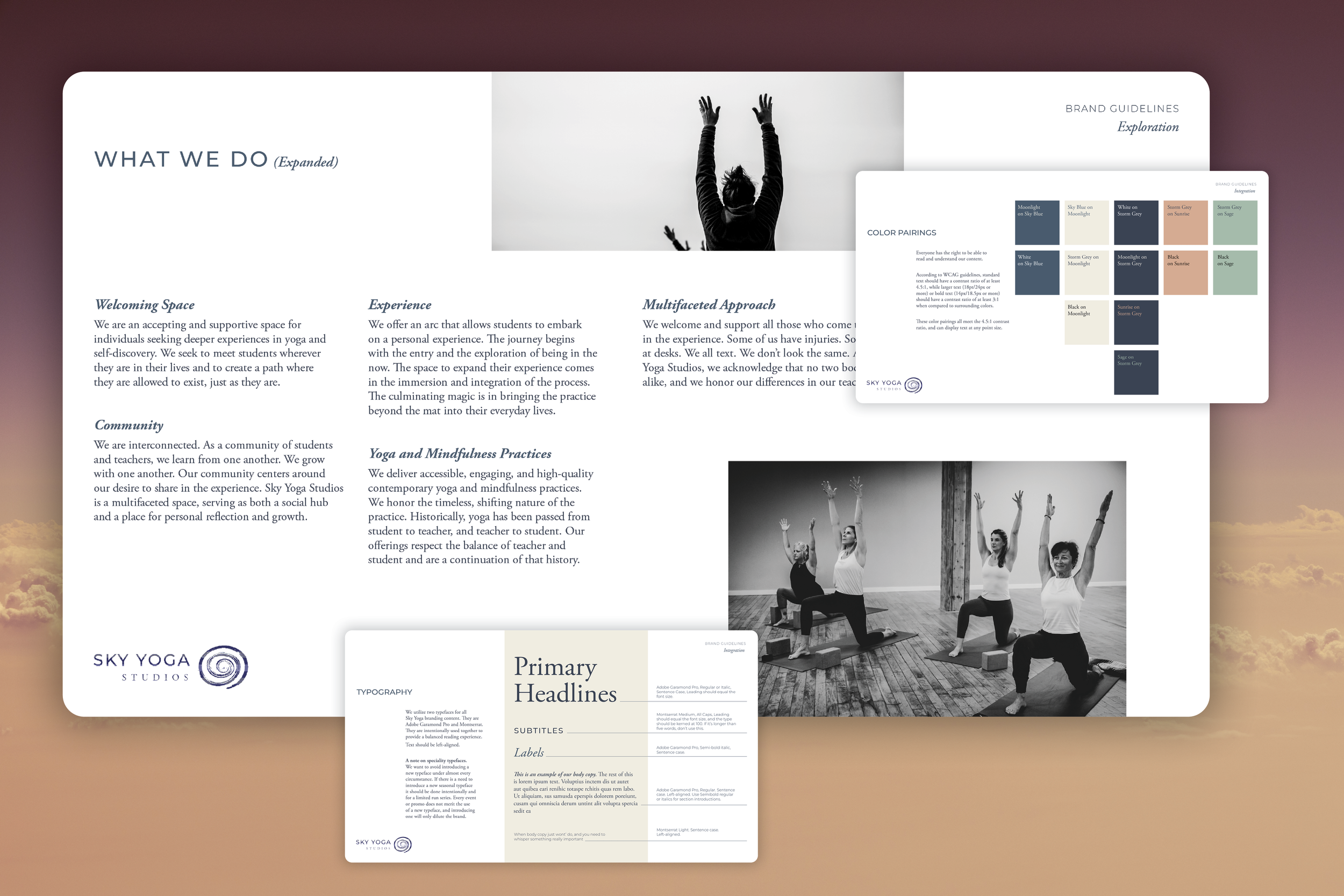
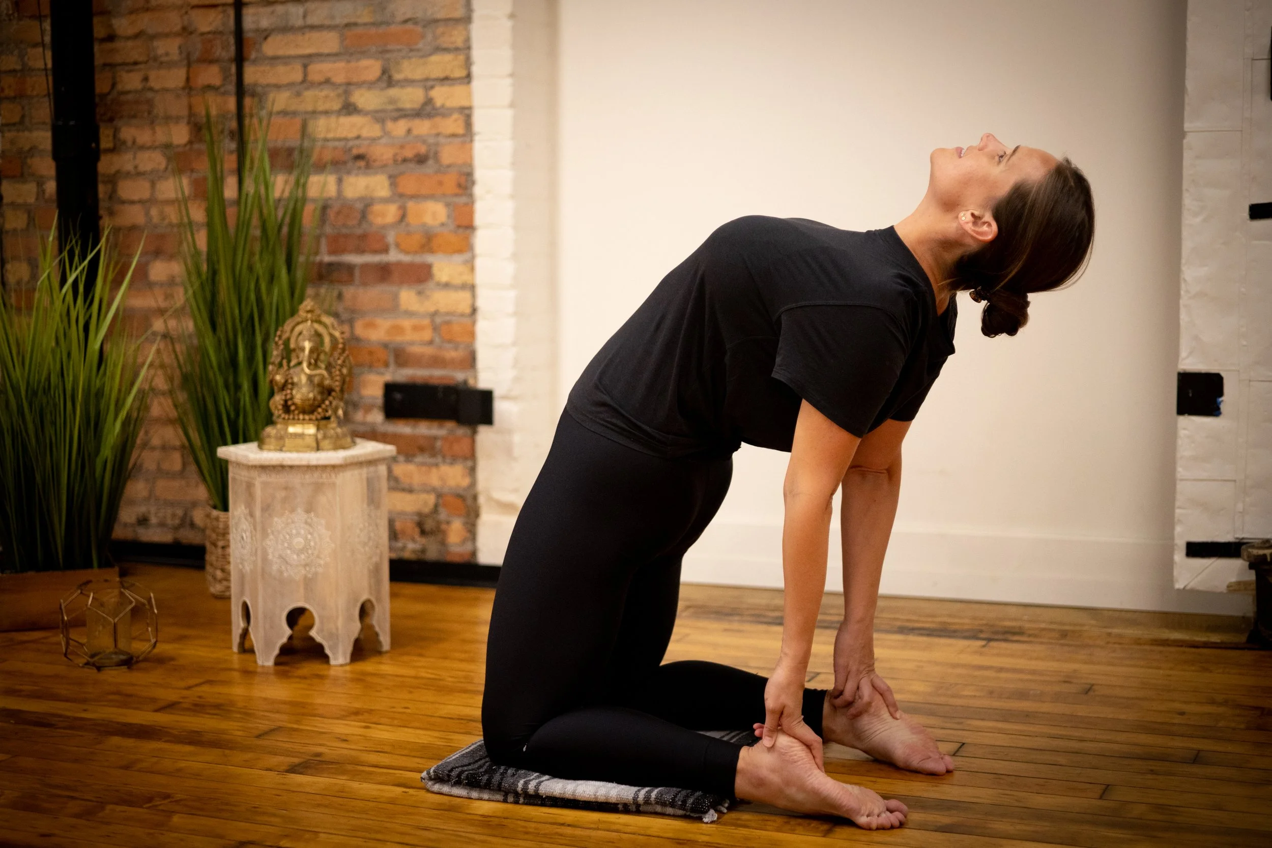
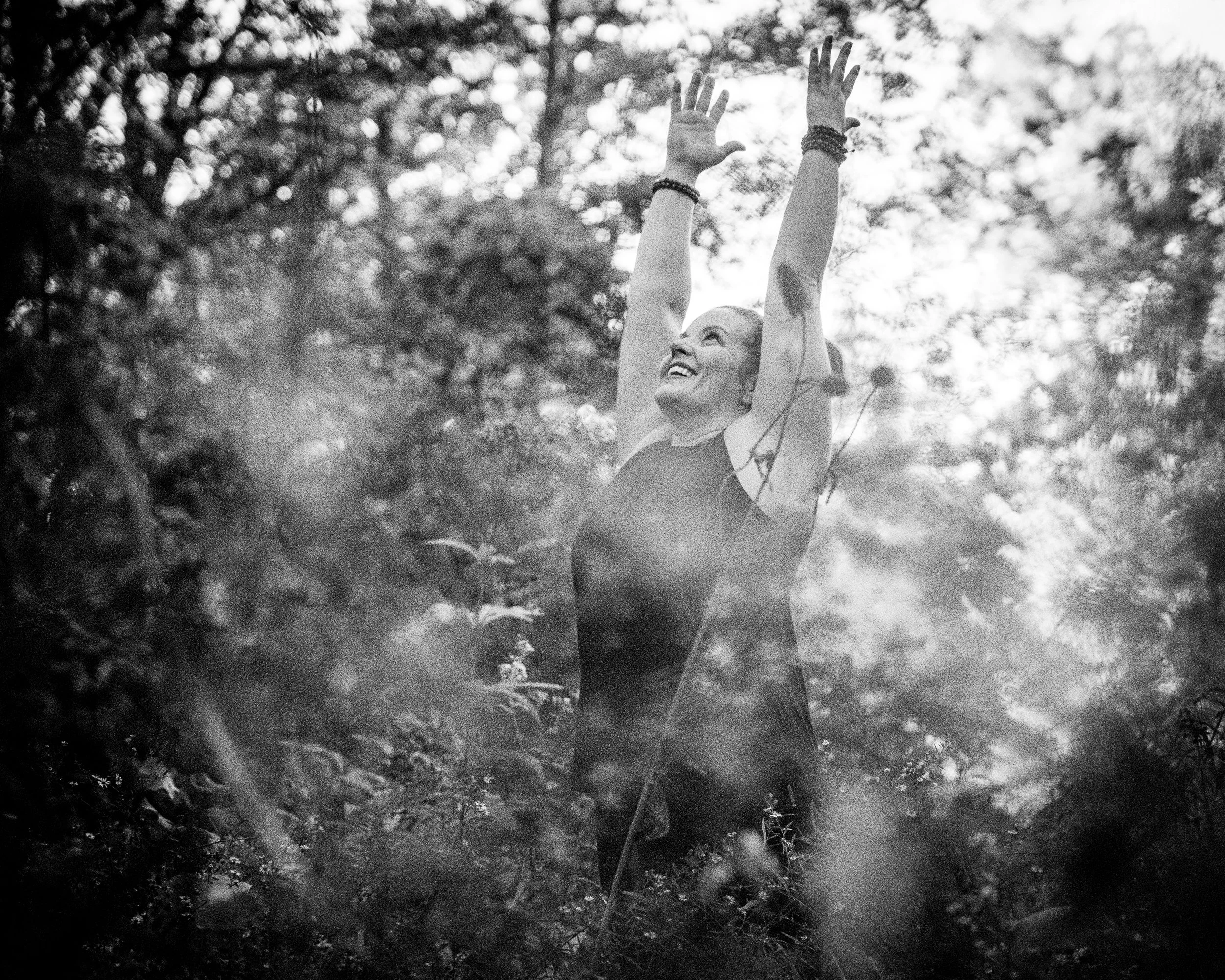

Sky Yoga Studios
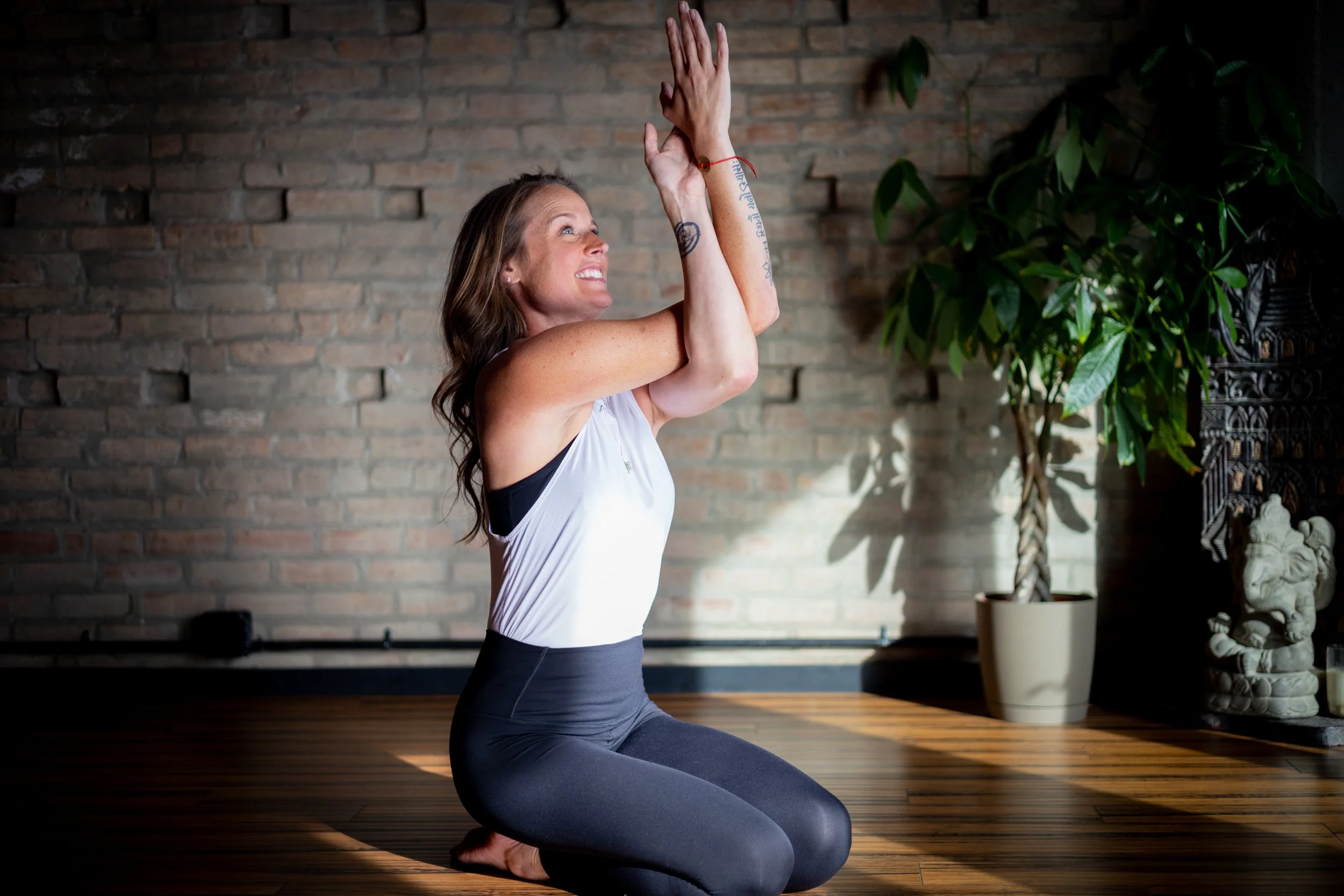
The client, Sky Yoga Studios, a boutique studio in Skaneateles, NY, acquired O Yoga—an established Syracuse studio with a loyal following. The new owner needed to transition to the Sky name without alienating longtime O students. I partnered with the owner on a phased integration strategy, using the visual identity and the in-studio experience to build trust and continuity. The work included a new style guide, staff portrait photography, an updated website, and consultation on interior updates.
Result: A brand shift that felt gradual, credible, and welcoming rather than abrupt.
”Working with Caitlin has been an absolute dream. She seamlessly translated my vision and the story of my business into a cohesive brand guide that I use daily. Her design work, paired with her thoughtful guidance through every decision, truly brought the brand identity to life. I couldn’t recommend her more highly.”—Courtney Chase, Owner
Relax your jaw.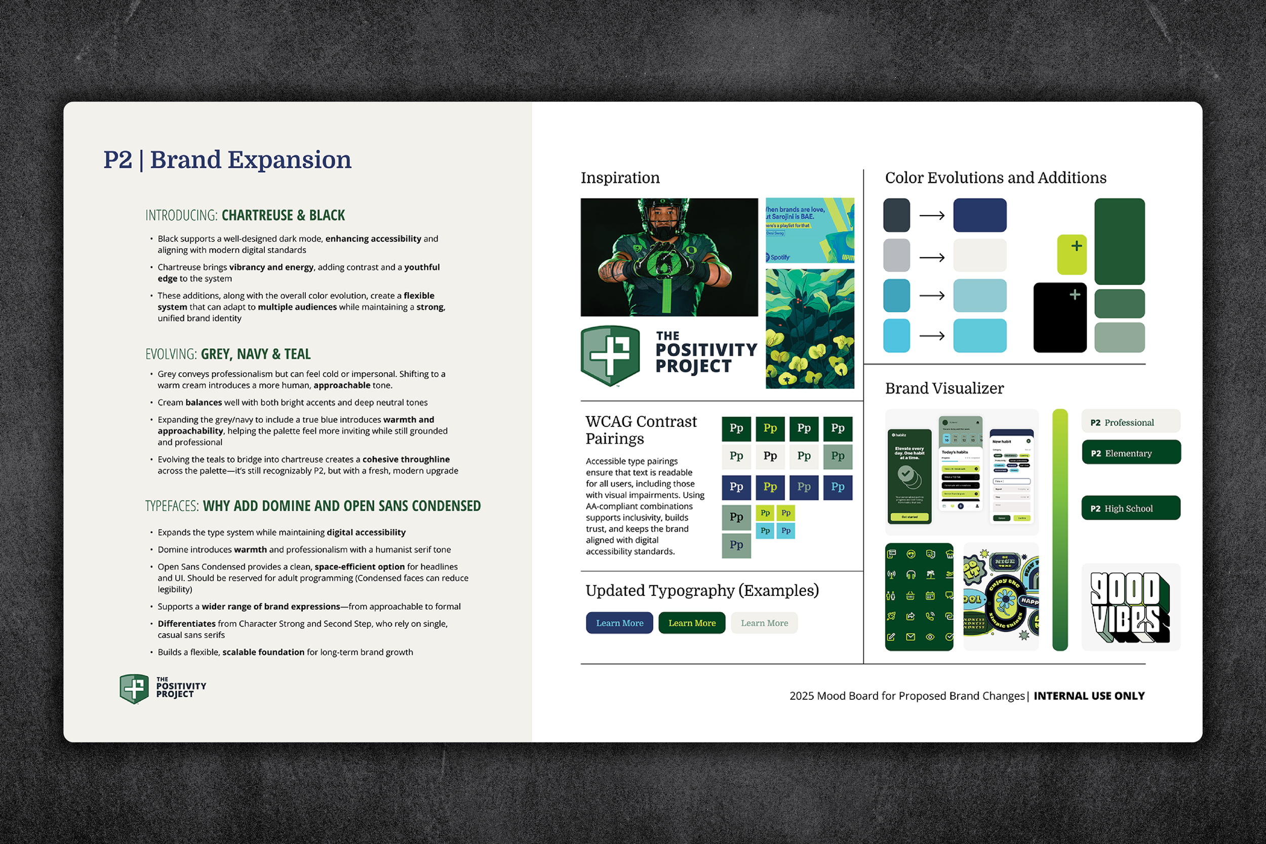
Other People Mindset.The Positivity Project
The Positivity Project (P2) develops social-emotional curriculum for K–12 schools nationwide. As the organization grew, materials across grade levels started to blur together, and older students read the visual style as too youthful. Working with the Director of Instructional Services, I audited the identity, reviewed the existing asset ecosystem, and conducted competitor research.
My recommendation was a “branded house” system with grade-band differentiation. It maintains equity in the core brand while allowing a more mature tone for older grades. The sub-brand framework has been implemented across curriculum materials and is being adopted organization-wide.
Result: A scalable identity update that clarifies grade levels, supports adoption, and reduces retention risk.